VISIONARIES
COVERS
SHOWS
SHOWS
Sound Check
That One Video
The Bigger Picture
That Tracks
UPROXX Mics
Indiecast
How I Blew Up
Fresh Pair
UPROXX Sessions
MUSIC + CULTURE
MUSIC + CULTURE
HIPHOPDX
INDIE MIXTAPE
COUNTRY MIXTAPE
DIME MAGAZINE
FILM/TV
LIFE/TRAVEL
WHAT WE DO
INSIGHTS
ABOUT
Privacy
Terms
Cookie Policy
COOKIES SETTINGS
Socials
YouTube
Instagram
TikTok
LinkedIn
…
The 'Stranger Things' Cast Kept Busy During The Long Wait For The Final Season By Focusing On Music
A deep dive on the music careers of the stars of the Netflix series.
Comedies, Dramas, and More
With That Game Changing Season Finale, ‘Industry’ Just Became TV’s Best Show
September 30, 2024
by:
Jason Tabrys
The Best Needle Drops From Season Three Of ‘The Bear,’ Ranked
July 2, 2024
by:
Steven Hyden
What to Binge-Watch
‘The White Lotus’ Music Supervisor Defends The Show’s Polarizing Season 3 Theme Song
February 28, 2025
by:
Josh Kurp
The Latest
The Best Physical Media Releases Of February 2026
March 2, 2026
by:
Derrick Rossignol
and
Philip Cosores
‘Boyfriend On Demand’: Everything To Know About Jisoo’s New Netflix Rom-Com Series
February 5, 2026
by:
Derrick Rossignol
‘The Beauty’: Everything To Know About Ryan Murphy’s New FX Series With Evan Peters And Ashton Kutcher
January 20, 2026
by:
Derrick Rossignol
The Best TV Shows Of 2025
December 18, 2025
by:
Jessica Toomer
,
Jason Tabrys
and
Philip Cosores
‘Euphoria’ Season 3: Everything To Know About The Highly Anticipated, Time-Jumping Return
December 16, 2025
by:
Derrick Rossignol
Featured
HBO's finance drama levels up (and down) in a third season that truly gives 'Succession' a run for its money.
by:
Kimberly Ricci
Issa Rae Is Making It Her Business To Give Black Stories The Voice They Deserve
by:
Wongo Okon
‘The Boys’ Season 4 Finale Power Ranking
by:
Kimberly Ricci
‘Cobra Kai’ Remains Undefeated At Closing The Generation Gap
by:
Kimberly Ricci
The Best TV Shows of 2024 (So Far)
by:
Jessica Toomer
and
UPROXX Entertainment
The Dragons Deserve Better On ‘House Of The Dragon’
by:
Jessica Toomer
The Best LGBTQ Movies & TV Shows Of 2024 (So Far)
by:
Danielle Ryan
John Mulaney's 'Everybody's In L.A.' Is A Late Night Party We're Going To Remember
by:
Jason Tabrys
The UPROXX TV & Film Heat Index
by:
Jessica Toomer
Riley Keough Unpacks That ‘Under The Bridge’ Finale
by:
Erin Qualey
Julio Torres On Building A Trippy Sketch-Comedy Sandcastle With ‘Fantasmas’
by:
Jessica Toomer
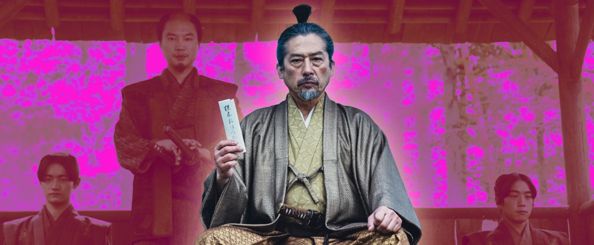
‘Shogun’s’ Hiroyuki Sanada Breaks Down The Show’s Surprising Finale
by:
Jessica Toomer
Steven Knight On More 'Peaky Blinders' & 'The Veil'
by:
Jessica Toomer
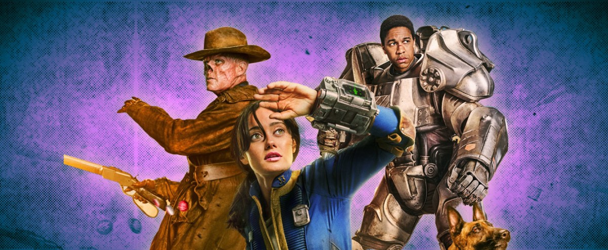
'Fallout' Is A Freakishly Fun Take On The Apocalypse And Video Game Adaptation Genre
by:
Jessica Toomer
Joel Kim Booster On Being 'Loot' S2's 'Alpha' Gay
by:
Jessica Toomer
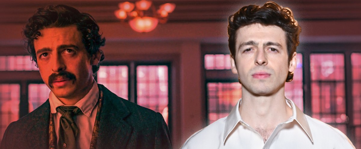
Anthony Boyle On 'Manhunt,' Not Being Changed By Success, And Why Irish Actors Nail American Accents
by:
Jason Tabrys
Cosmo Jarvis And Anna Sawai On FX's 'Shogun' And Sword-Fighting Bootcamps
by:
Jessica Toomer